I struggled with this one at first. Though I wanted to do a very large and elaborate project at first, it took some time to come to that idea. The initial idea was to incorporate one of my previously used themes of power, and the dichotomy of the box - the natural wood product but manmadeness of the glue around the seams. I continued to stay with that idea until the very end. Though I am sure there were several spots that I could have improved upon, my final product was satisfactory and clearly delivered the message I wanted to deliver.
Artsy Fartsy
An art blog for an intro Art course for a liberal arts education. I guess I am going to be a well rounded student after all.
Sunday, December 16, 2012
Final Project
I struggled with this one at first. Though I wanted to do a very large and elaborate project at first, it took some time to come to that idea. The initial idea was to incorporate one of my previously used themes of power, and the dichotomy of the box - the natural wood product but manmadeness of the glue around the seams. I continued to stay with that idea until the very end. Though I am sure there were several spots that I could have improved upon, my final product was satisfactory and clearly delivered the message I wanted to deliver.
Public Art Drains
I chose to go with a topic that was not necessarily the positive image of the theme water.
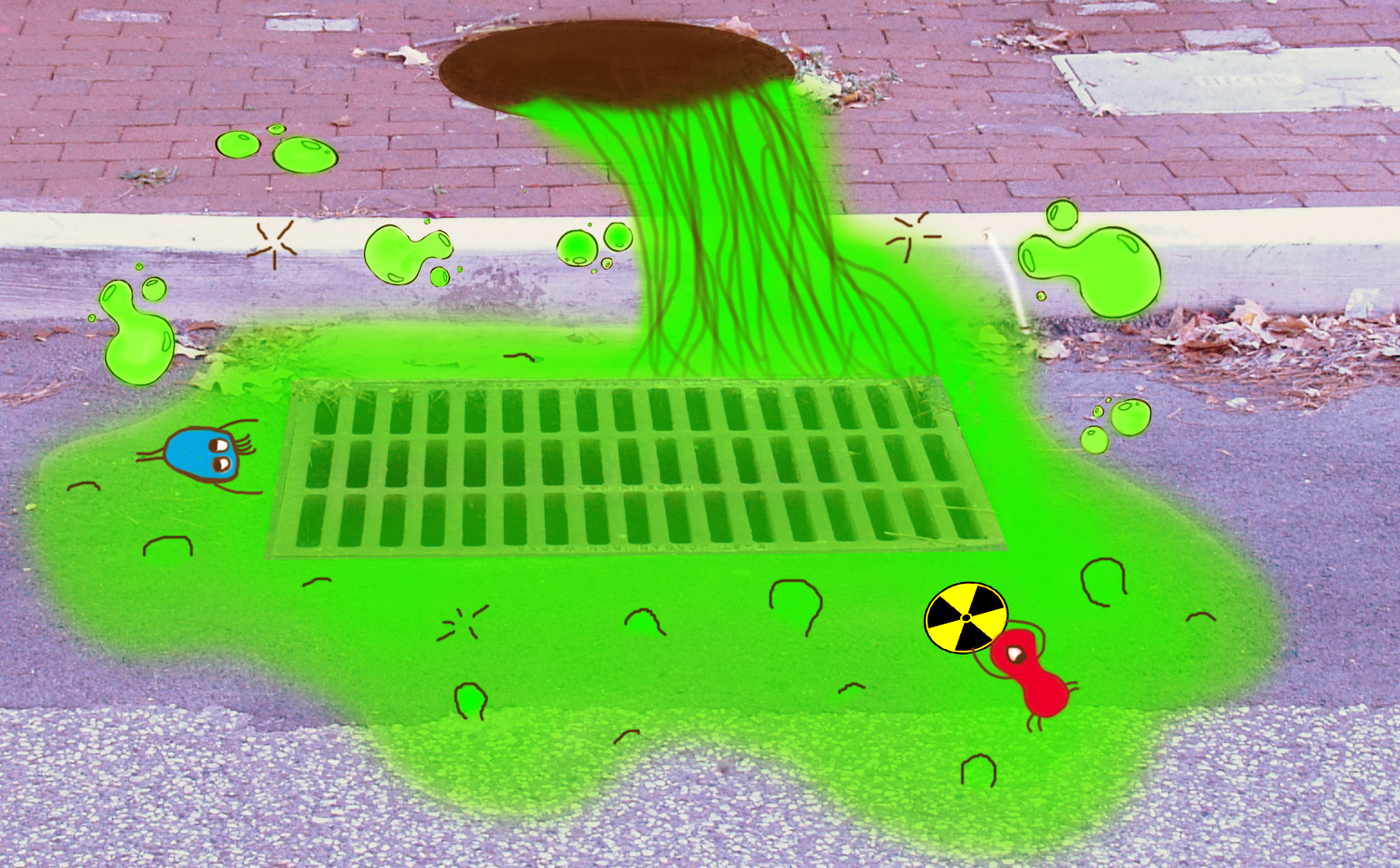
 The manhole cover is painted to resemble a drain
pipe. The pipe is leaking toxic waste,
with mutated creatures and frothy bubbles on top of the puddle of waste
This is a public art project highlight storm drains in downtown Meadville, Pennsylvania. Human waste is a topic that is typically avoided, but one that needs to be brought to attention. The theme of toxic waste was chosen to demonstrate to public and remind viewers how any polluting act can end up contaminating the water most important to the community. In Meadville, people need to be aware that in the thousands of gallons of rainwater washed into French Creek every year, there are also molecules in solution, stemming from human activities that can be detrimental to this body of water.
For this design, the area on Chestnut Street, between North Main and Water Street was selected, making a total of eighteen drains to be highlighted. To demonstrate this design, four of the drains were selected, located on Chestnut Street in Meadville, between Water Street and Market Street. All of these drains are highlighted by painting on the sidewalk, the surrounding street and curbside, and the drain itself. They each highlight a different aspect of the toxic waste theme. Each drain should be assessed as an individual project first and foremost, as the drains are far enough apart to do so. After the individual composition is assessed, the theme between all of the drains should be considered.
Toxic Waste
-
 The manhole cover is painted to resemble a drain
pipe. The pipe is leaking toxic waste,
with mutated creatures and frothy bubbles on top of the puddle of waste
This drain has painted plastic cups, glass bottles,
cans, cigarette packets and other miscellaneous waste is scattered to the side. A slimy trash juice puddle overlaps the drain
and litter.
Car
Pollutants -
Coal Plant -
The light post and streetlight pole are painted to
resemble coal stack towers. Coal is
scattered around the drain, with a coal plant with smog painted on the curb and
sidewalk.
Wednesday, October 31, 2012
Site Pictures and Plans
After much debate in class, we settled down to just five sites and individually chose our own sites. I decided that one of the best opportunities offered was the one to beautify our storm drains and manhole covers. When we got the map of all of Meadville's drains, we decided to focus on just one street: Chestnut Street from North Main/Diamond Park to the Downtown Mall. With three of us working, and no desire to overwhelm ourselves, we thought that three drains per person would be a good number. Here are the drains that I was assigned. They are located on Chestnut Street between Market Street and Park Street.
 |
| South side of Chestnut St and Market St (appx. 3') |
 |
| North side of Chestnut St and Market St. (appx. 2') |
 |
| South side of Chestnut St, between Market Street and Park Ave. (appx 2') |
Some ideas that I had, after looking at Meadville's own art, other towns' street art, and considering our theme of "water," included:
- modeling each drain in a similar style, but having an individual French Creek critter dominate the scene
- a single one panel abstract water design that changes in style from drain to drain (ie Impressionist, modern, etc)
- the above, but changes in color
- a theme that tells a story up and down Chestnut St. (see the blog entry Urban Art for barrier projects that do this)
Here are some really neat ideas from sewer drains around the world:
Tuesday, October 30, 2012
Environmental Art
For the environmental art research aspect of my class, I included links (the far more important part), with examples from either the artist or particular project.


Urban Art
We were asked to do some research about both public and environmental art before starting on our own urban art projects. Here are a few of my favorite examples of public art:
| http://www.designer-daily.com/a-wall-that-plays-music-when-it-rains-21016 |
| Post Alley, Seattle http://daily.sightline.org/2011/08/26/alley-alley-in-come-free-2/ |
The following are all from:
| Plan Ahead - NYC |
| Container Series - NYC |
| Welcomed Guests - NYC |
| Worker Bees - NYC |
| Tillary Street Barrier - NYC |
| Urban Garden - NYC |
Tuesday, October 23, 2012
Collages
This assignment I had trouble with. For some reason, I have a hard time understanding what exactly my professor means when an assignment is given. For my first attempt at collages with composition, my pieces had little to do with composition. I liked them well enough, but they were very simple, and didn't really dabble with the idea of composition. When I better understood the assignment, I attempted one more. I started by combining two of my first pieces and adding more depth to them. As soon as I got the thumbs up, I had this cat in the bag. After I found a subject or idea to focus on, the second two were not terribly hard. I am such a perfectionist though, that finding the exact materials I wanted to work with were difficult at times, and getting it just so was even harder, I think all of my final pieces came out well.

***UPDATED COLLAGES
Monday, October 15, 2012
Object Transformation
This happened. Looking back on it now makes it seem like much longer ago ago that it did. Now, all disassembled and in my room, it doesn't seem like all the work I put in really came to all that much. So art goes.


The next assignment was to make a major change to our objects. My lamp had morphed so much already. The more I had thought about it, the darker the object seemed to become for me (oh, the irony). Here I am, sitting in front of a blinding light, and all I can think about is the darkness behind it. Had I been better with shadows and math, I would have loved to attempt a piece centered around the playfulness of light and dark. After a little experimentation, I found that it was much more difficulty than I wanted to deal with during the school year. Instead, I disassembled it, and came up with this guy, struggling to keep the light around him:
.JPG)
But how to use the rest of it? I love LOVED what I had done, but it didn't feel complete for the assignment given. So I did it. I broke the lamp. After much thought and experimentation on how to incorporate it, I tried to depict two scenes, both about the struggle to keep the lamp and the brightness alive.
.JPG)
Then - another obstacle. As I was setting my object up for display, I reread the criteria and realized I had to incorporate the words from the list, along with the drawings and photographs into my piece. GAH! I wish I could just go back to the one little guy, pulling up the light. But I trudged forward into the battleground and did my best. After many attempts, I can say, though not perfect by any means, my assignment was well done.
We started off with an object of our choosing, and the assignment: take pictures of the object, create a list and do a line drawing. This seemed easy enough. I am not the biggest fan of drawing, but I like to think that I am better than average bear at photography (it helps that I have thumbs and not claws). My drawing didn't turn out too poorly, and I really enjoyed giving it some color.
. 

The next assignment was to make a major change to our objects. My lamp had morphed so much already. The more I had thought about it, the darker the object seemed to become for me (oh, the irony). Here I am, sitting in front of a blinding light, and all I can think about is the darkness behind it. Had I been better with shadows and math, I would have loved to attempt a piece centered around the playfulness of light and dark. After a little experimentation, I found that it was much more difficulty than I wanted to deal with during the school year. Instead, I disassembled it, and came up with this guy, struggling to keep the light around him:
.JPG)
But how to use the rest of it? I love LOVED what I had done, but it didn't feel complete for the assignment given. So I did it. I broke the lamp. After much thought and experimentation on how to incorporate it, I tried to depict two scenes, both about the struggle to keep the lamp and the brightness alive.
.JPG)
Then - another obstacle. As I was setting my object up for display, I reread the criteria and realized I had to incorporate the words from the list, along with the drawings and photographs into my piece. GAH! I wish I could just go back to the one little guy, pulling up the light. But I trudged forward into the battleground and did my best. After many attempts, I can say, though not perfect by any means, my assignment was well done.
Subscribe to:
Posts (Atom)


.JPG)
.JPG)


.JPG)
.JPG)